Chrono
Chrono required a visual identity that communicates flow, focus, and control without feeling rigid or overwhelming. The brand needed to feel calm and intuitive, offering users a sense of clarity and stability rather than urgency or pressure. The identity was intended to appeal to modern professionals and creatives seeking a more mindful approach to productivity. Visually, the brand needed to feel clean, modern, and subtly futuristic while remaining approachable and human.
Project
Branding Materials, Logo Design, UX Design
Design Goal
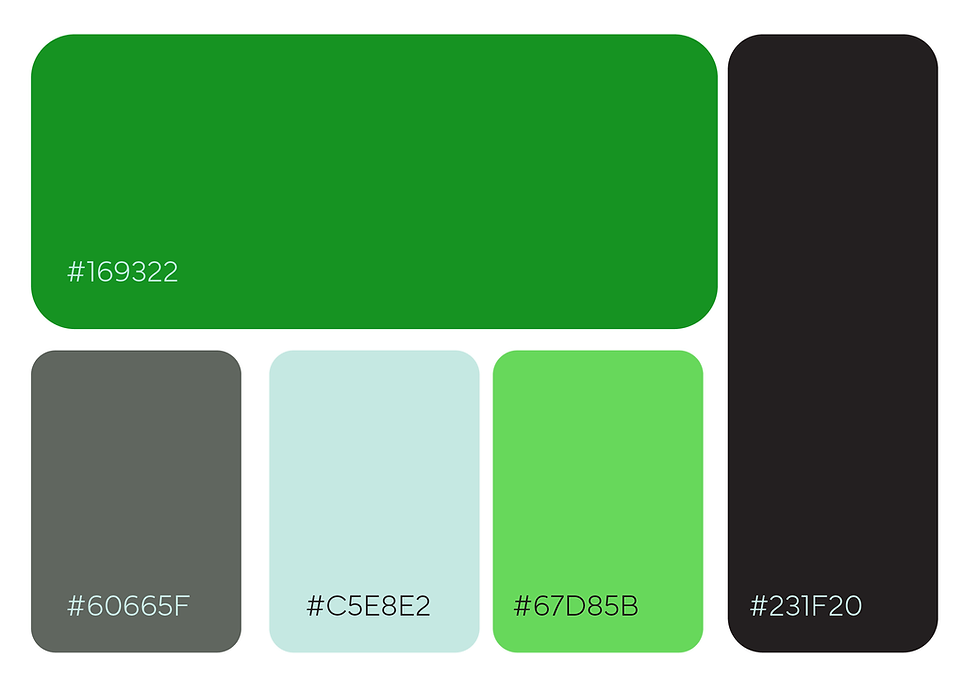
The logo utilizes looping forms to suggest continuity, balance, and the smooth progression of time. A bold green palette reinforces themes of growth, clarity, and mental freshness, while the restrained, minimal structure keeps the system grounded and accessible.